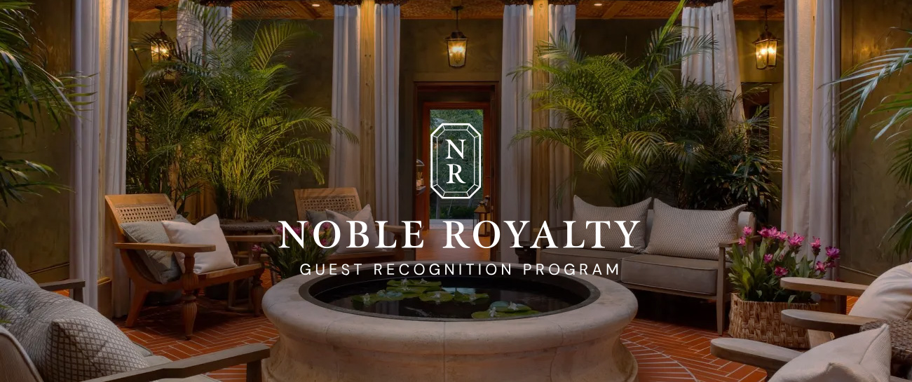
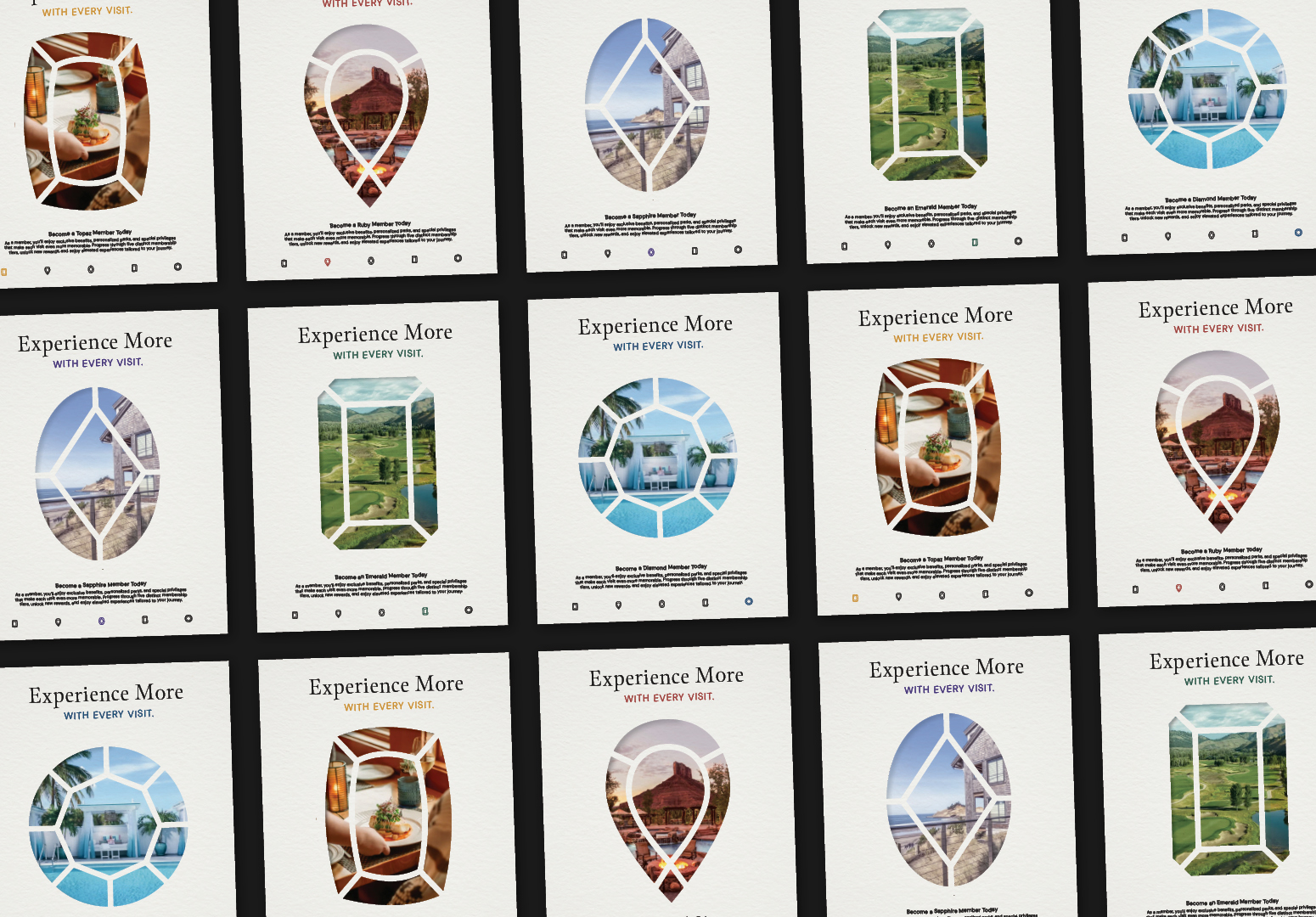
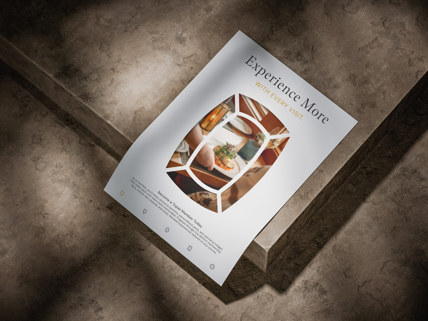
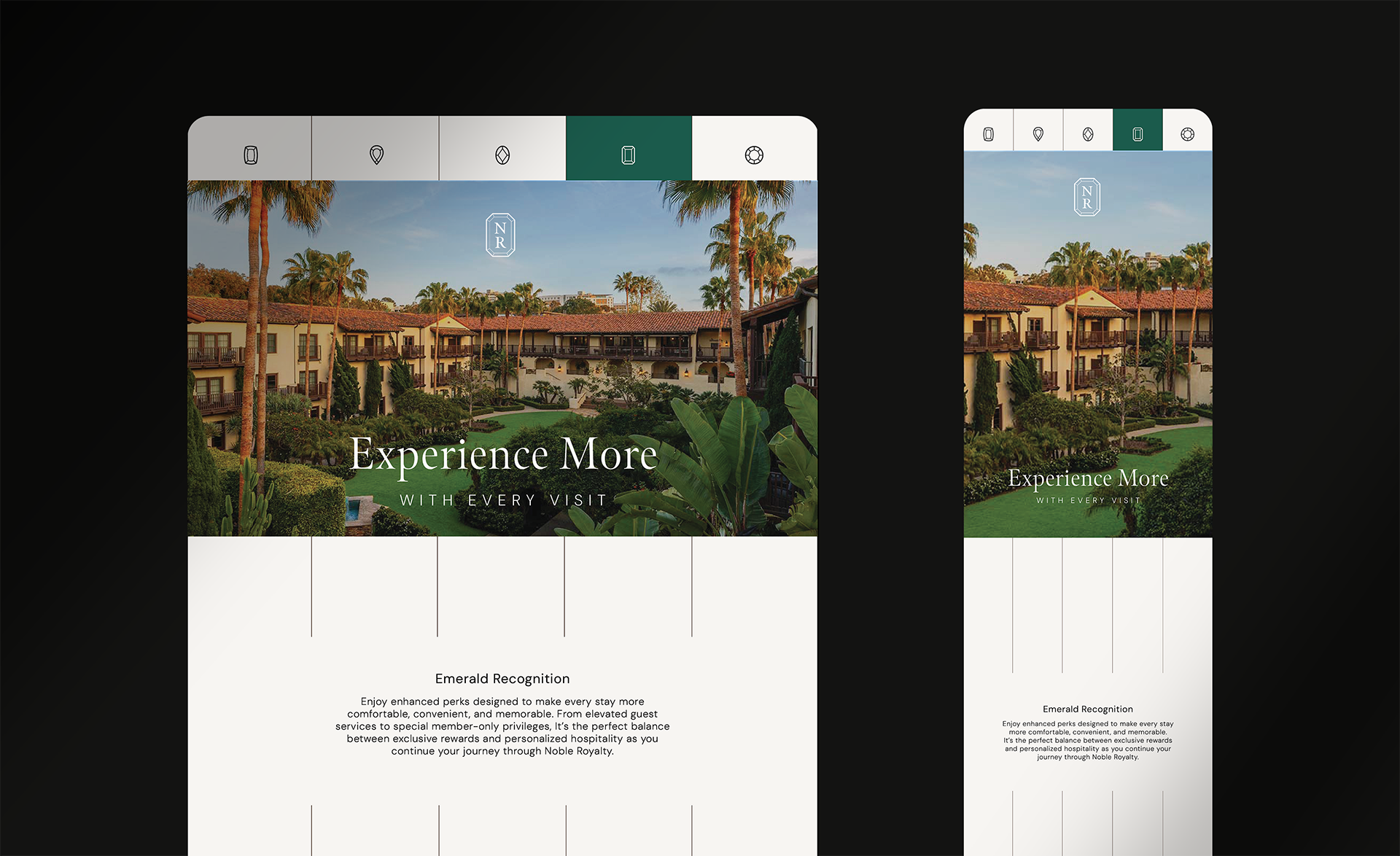
Problem
The program needed a visual identity that felt premium and sophisticated enough to align with luxury hospitality properties while remaining approachable for a broad audience. Because the experience centered around tiered guest recognition, the branding also needed a clear way to differentiate each level.
Solution
The final identity system centered around a custom gemstone-inspired logo, inspired by the programs name itself and paired with five distinct gemstone icons representing each membership tier. A restrained palette of muted, elevated tones established a refined visual foundation, allowing the tier icons, colors and additional elements to stand out clearly without overwhelming the brand.